Introduction
A strong visual identity helps an organisation express its personality and values through design.
Every element, from the logo and colours to the layout and typeface, works together to create an impression that audiences instantly recognise.
In this lesson, we’ll learn about:
- The elements of visual identity
- Combining elements to shape perception and emotion
- Using appropriate elements for different target audiences

The Elements of Visual Identity
Every logo, font, and colour choice communicates something about the who the organisation is and what it stands for.
These design decisions combine to make a consistent, recognisable identity.
The main elements include:
- Graphics (shape or symbol)
- Typography
- Colour palette and meaning
- Layout and complexity
Let’s look at each of these elements of visual identity in more detail.

Graphics
Graphics form the core visual element of a brand’s identity.
They include logos, icons, and symbols that help audiences quickly recognise the brand.
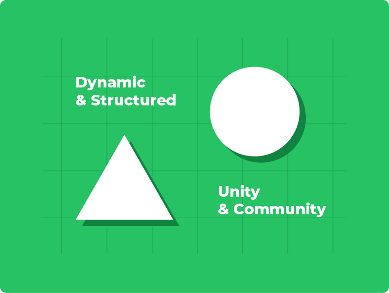
Shapes and symbols often carry meaning.
For example, a circle can suggest unity and community, while sharp-edged shapes like triangles can feel dynamic or structured.
A strong graphic should be simple enough to remember but distinctive enough to stand out.
Think of the Nike swoosh or Apple’s bitten apple. Both are minimal designs that convey motion, innovation, and confidence.
Reflect for a moment: what does the logo shape of your favourite brand suggest about its personality?
Typography
Typography refers to the style, size, and arrangement of text.
It shapes the tone of communication.
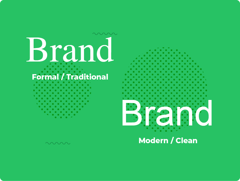
For instance, serif fonts (like Times New Roman) often feel formal or traditional, while sans-serif fonts (like Arial or Helvetica) look clean, modern, and approachable.
A brand’s choice of font becomes part of its visual signature.
For example, Coca-Cola’s flowing script reflects friendliness and nostalgia, whereas Google’s rounded sans-serif font feels simple and accessible.
Typography also needs to be readable across different sizes and platforms, keeping the brand consistent from posters to mobile screens.
Colour Palette & Meaning
Colour is one of the most powerful elements in visual identity because it creates immediate emotional responses.
Brands carefully select their colour palette to match their values and audience expectations.
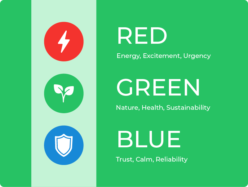
For example:
- Blue often conveys trust, calm, and reliability
- Red suggests energy, excitement, or urgency
- Green is associated with nature, health, and sustainability
Most brands use a primary colour and a few supporting colours for flexibility.
Consistent use of these colours strengthens recognition and emotional connection.
Layout & Complexity
Layout refers to how design elements are arranged on a page or screen.
This includes spacing, alignment, and balance between text and visuals.
A clear, well-structured layout makes information easier to understand and gives a sense of professionalism.
The complexity of a design also affects its impact.
A minimal layout with lots of white space can look modern and calm, while a dense, detailed layout might express creativity or energy.
For example, Apple uses clean layouts to highlight simplicity, whereas gaming brands often use layered, high-energy visuals to excite their audience.
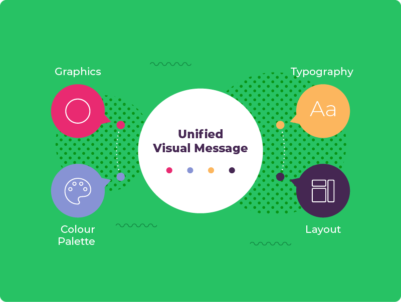
Combining Elements to Shape Perception & Emotion
Each element of visual identity works best when it complements the others.
Graphics capture attention and establish instant recognition, while typography communicates tone (e.g. formal, friendly, or bold).
Colour adds emotional depth, setting the mood before a word is even read.
Layout then guides how the viewer’s eye moves, ensuring the design feels balanced and easy to navigate.
When these parts work together, they form a unified visual message that reflects the brand’s personality.
Using Appropriate Elements for Different Target Audiences
A strong visual identity also depends on how well it matches the intended audience.
The same design choices that attract one group might not appeal to another.
For instance, a brand aimed at young consumers could use bold fonts, bright colours, and playful shapes to feel modern & energetic.
In contrast, a company targeting business professionals might use a structured layout, cooler colour tones, and refined typography to communicate reliability and expertise.
By adapting the use of graphics, colour, and typography to suit their audience, they ensure that the identity not only looks appealing but also feels appropriate and relatable.
Lesson Summary
A visual identity is made up of elements that work together to represent a brand’s personality and values.
Graphics provide instant recognition, while typography expresses tone and style.
Colour creates emotional impact and helps shape how the brand feels, and layout controls how information is presented and understood.
When these elements are combined thoughtfully, they create a consistent and memorable impression that influences how people perceive the brand.
Designers also adapt these elements to suit different target audiences, ensuring that the visual identity feels appropriate, appealing, and trustworthy.