Introduction
Have you ever looked at a website or an app and wondered how it all comes together before anyone actually builds it?
One way designers plan things out is by creating something called a wireframe.
In this lesson, we’ll learn about:
- The components of wireframes
- The type of software that can be used to create a wireframe
- Advantages and disadvantages of wireframes
- Creating an original wireframe for a given scenario

What is a Wireframe?
A wireframe is a simple visual guide that represents the structure of a page or screen.
It’s often black and white, or sometimes grey, and it highlights the layout rather than the final design.
For example, it might just have boxes to show where images will appear, lines to show where text goes, and placeholders for buttons.
The idea is to give an early, rough idea of how a page or screen will look without adding the finishing touches.
Designers use wireframes early in a project because they’re quick to create and easy to change.
If your teacher wants a different header size or your friend thinks the navigation menu should be on the left not the top, you can adjust the wireframe without having to re-do any detailed design work.

Components of a Wireframe
Wireframes are not about showing off artwork.
Their purpose is to convey where things should be placed and how the user might interact with them.
However, even though wireframes are meant to be simple, they still include important elements:
- Header
- Navigation menu
- Body content
- Footer
- Call-to-Action (CTA) buttons

Components of a Wireframe
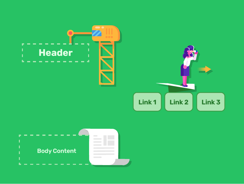
Header
This is usually at the top of the page, containing your logo or title.
Navigation Menu
Often just lines or boxes indicating where the main buttons or menu items will be.
Body Content
This is where text, images, or other main features appear.
Boxes might represent images, and lines often represent where paragraphs of text will go.
Components of a Wireframe
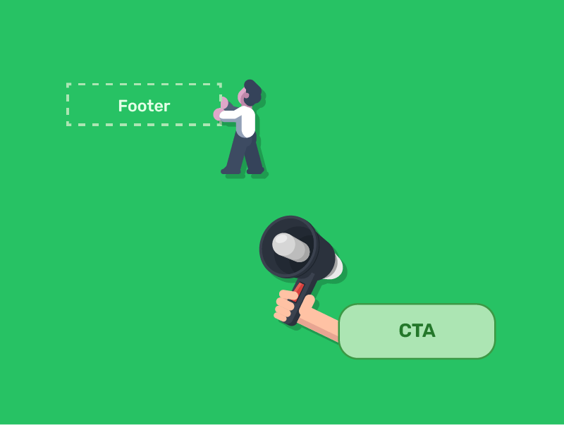
Footer
Located at the bottom, the footer might contain extra links, copyright information, or other details.
Call-to-Action (CTA) Buttons
If you have something you really want users to do, like “Sign Up” or “Buy Now,” you can mark these out with a bold shape or text placeholder.
Quick Quiz: What are Wireframes?
Types of Software for Creating Wireframes
Wireframes can be made using a variety of tools.
Some people prefer pen and paper, which is often the quickest way to brainstorm ideas.
However, there are also plenty of digital tools available.
You could create your wireframe with basic drawing software, like Microsoft Paint, or with presentation tools like PowerPoint.
However, specialist wireframing tools like Balsamiq, MockFlow, or Sketch has built-in templates and elements specifically designed for wireframes.
These tools help you quickly drag and drop standard features such as headers, text boxes, and buttons.
Choosing the right tool usually depends on your personal preference and the complexity of the project.

Advantages of Wireframes
Save Time and Money
Fixing issues at the wireframe stage is much cheaper than after full design or development.
Improve Collaboration
Everyone can understand the basic structure without being distracted by visual elements.
Focus on User Experience
They help designers think about how users will interact with the interface.
Clarify Requirements
They make it clear what functionality needs to be implemented.
Quick to Create and Modify
Changes can be made rapidly during the planning stage.

Disadvantages of Wireframes
Limited Visual Appeal
They can appear boring or incomplete to clients who aren’t familiar with the design process.
Lack Context
Without colour and imagery, some elements might not make sense to viewers.
Can’t Fully Test User Experience
The simplified nature means you can’t test all aspects of interaction.
Might Constrain Creativity
Sometimes sticking too closely to wireframes limits design innovation later

Quick Quiz: Wireframe Software, Pros and Cons
Creating a Wireframe for a Scenario
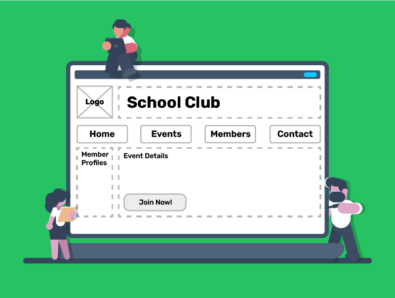
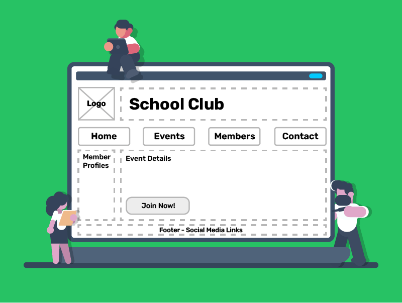
Let’s say you need to design a homepage for a school club’s website.
The club wants to show upcoming events, member profiles, and a sign-up button for new members.
Here’s how you might approach creating wireframes for this project.

Creating a Wireframe for a Scenario
Step 1
Draw a rectangle across the top for your site’s header. This might include the club’s name and logo.
Step 2
Add a horizontal line or a few small boxes below the header to represent the navigation links (e.g., Home, Events, Members, Contact).
Step 3
Sketch out a larger box in the centre for event details. Perhaps add a smaller box on the side for member profiles.
Step 4
Use a bold shape or highlighted box near the top or middle to catch users’ eyes. Label it “Join Now.”
Creating a Wireframe for a Scenario
Step 5
Finally, place a slim rectangle at the bottom for contact details or social media links.
Once you have this basic outline, you can share it with others.
Ask: “Is this layout easy to follow?” or “Where would you look first?”
Tweak your wireframe based on their feedback before moving on to design details.
This process ensures everyone agrees on the general look and feel before you spend time perfecting images, fonts, and colours.
Lesson Summary
A wireframe is a simple outline that displays a website or app’s basic structure.
Key components include headers, navigation menus, body content, footers, and calls-to-action for effective layouts.
Wireframes save time, encourage feedback, and highlight structure before focusing on detailed design elements.
They can seem too basic, lack final design details, and require extra steps in some workflows.