Introduction
Whether you’re creating a poster, a website, or even an app, a visualisation diagram can help bring ideas to life by giving you, your clients, and your teammates a clear picture of the final outcome before you start building.
In this lesson, we’ll learn about:
- The components of visualisation diagrams
- The type of software that can be used to create a visualisation diagram
- Advantages and disadvantages of visualisation diagrams
- Creating an original visualisation diagram for a given scenario

What is a Visualisation Diagram?
Visualisation diagrams are graphical representations that help us picture how a finished product or system might look and work.
Unlike wireframes that focus on just layout and structure, visualisation diagrams show the visual elements and design features.
This can be done by using actual colours and images in your design, almost like a prototype, but is often done through the use of annotations.
These diagrams give everyone a clearer picture of what the final product could look like before it’s actually built.
Think of them as a sneak preview – they help clients, designers, and developers “see” the finished product when it’s still in the planning stages!

Components of a Visualisation Diagram
A visualisation diagram doesn’t have to be a beautiful, fully polished image; it’s meant to show roughly how things will be laid out.
While you’ll still include many of the structural elements we looked at in a wireframe, the key components of a visualisation diagram are:
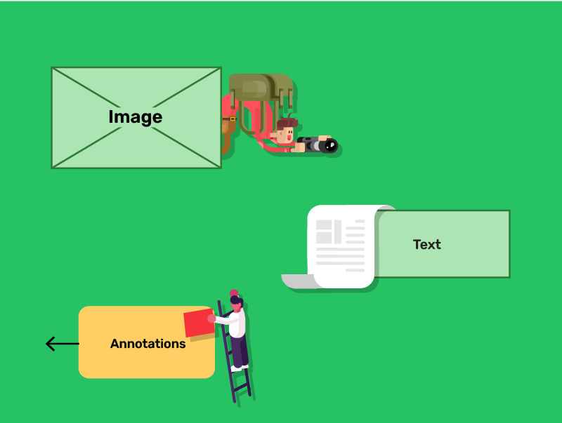
- Images or placeholders
- Text
- Annotations
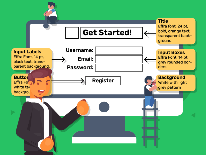
Components of a Visualisation Diagram
Images or Placeholders
Even if you don’t have the final images, you might use boxes or sketches to represent where they’ll go.
Text
You could write the actual text or simply label where text might appear. Think of things like headings, labels, or important content.
Annotations
Adding notes about colours, fonts, or themes can help set the tone of the final product
These little notes can also explain details on content, such as “This box will be an interactive map”.
Quick Quiz: What are Visualisation Diagrams?
Types of Software for Creating Visualisation Diagrams
When creating a visualisation diagram, you can pick a method based on your goals and experience.
Pen and paper is a simple, effective option for quick sketches without technical fuss.
If you prefer a computer but want a user-friendly tool, programs like PowerPoint let you arrange shapes, text boxes, and images.
However, if you need advanced features such as collaborative editing, precise placement, or built-in design elements, specialist tools like Figma and Adobe XD stand out.
Both these programs even allow multiple people to work on the same project in real time, which is ideal for group tasks
In the end, pick whatever fits your needs best.

Advantages of Visualisation Diagrams
Easy to Understand
A diagram is a quick way to show how a design might be laid out, making it simple for others to follow.
Quick to Produce
Sketching or dragging shapes around in software won’t take too long, helping you develop ideas rapidly.
Encourages Feedback
By showing your plan visually, it’s easier for people to point out changes or give suggestions, which can save time later.
Helps with Organisation
A visual layout helps you or your team keep track of where everything belongs.

Disadvantages of Visualisation Diagrams
May Not Reflect the Final Product Perfectly
Since visualisation diagrams are just outlines, the final product might still look quite different.
Risk of Oversimplification
If you only rely on a quick sketch, you could miss technical details that matter in the final build.
Requires Updating
If lots of changes are made, your diagram might become out-of-date. Keeping it current can be time-consuming.
Not Always Detailed
Some people might prefer more detailed technical diagrams or prototypes to see exactly how features will function.

Quick Quiz: Visualisation Diagram Software, Pros and Cons
Creating a Visualisation Diagram for a Scenario
Now that you know the key points, let’s look at how you might create your own visualisation diagram for a given scenario.
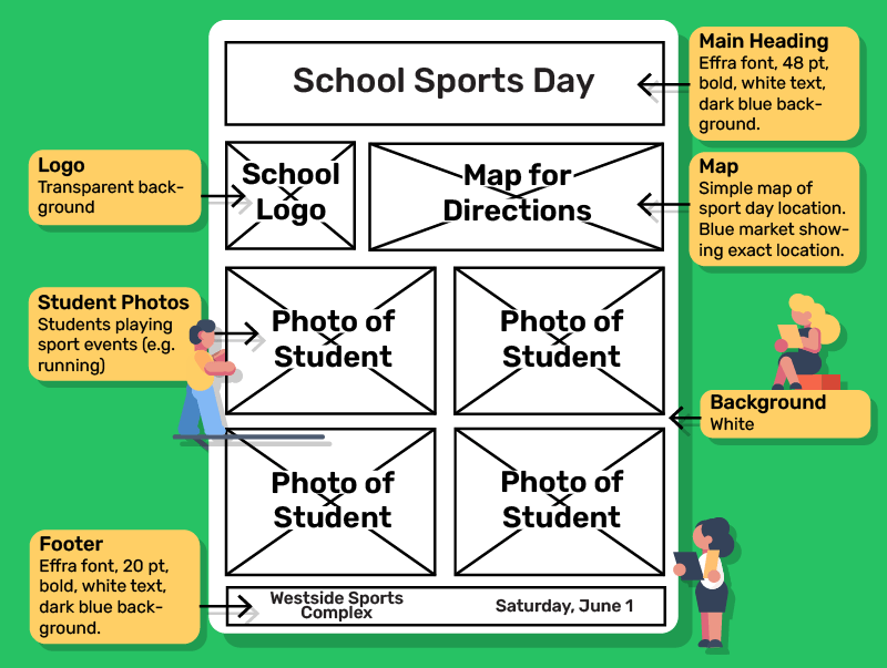
Imagine you have been asked to design a promotional poster for a school sports day.
Here’s how you might approach creating a visualisation diagram for this project.

Creating a Visualisation Diagram for a Scenario
Step 1
Grab a piece of paper and draw a large rectangle to represent your poster. Add boxes or circles where you think the main images and text will go.
Step 2
Write notes about what each section will be. For instance, “School logo” at the top left, “Main heading: Sports Day” in the centre, or “Venue and date details” at the bottom.
Step 3
Even if you can’t settle on the exact shades, you might label areas with a “blue header” or “bold font” for the main heading.
Step 4
If the poster will feature student photos or a small map, mark that clearly.
Creating a Visualisation Diagram for a Scenario
Step 5
Show your sketch to others. Ask if the layout makes sense. Are the headings clear? Is there space for all the information needed?
Step 6
Based on feedback, change any sections that don’t work. Maybe the school logo needs to be bigger, or the date might work better at the top.
Remember, a good visualisation diagram should be detailed enough to show how the final product will look, but doesn’t need to be a perfect replica.
The goal is to communicate your visual design ideas clearly.
Lesson Summary
A visualisation diagram is a simple layout showing how elements may appear in the final product.
Key components include images, text and annotations.
Visualisation diagrams are quick, easy to understand, and encourage helpful feedback from viewers.
They can be less detailed, risk oversimplification, and require updates when changes are made.