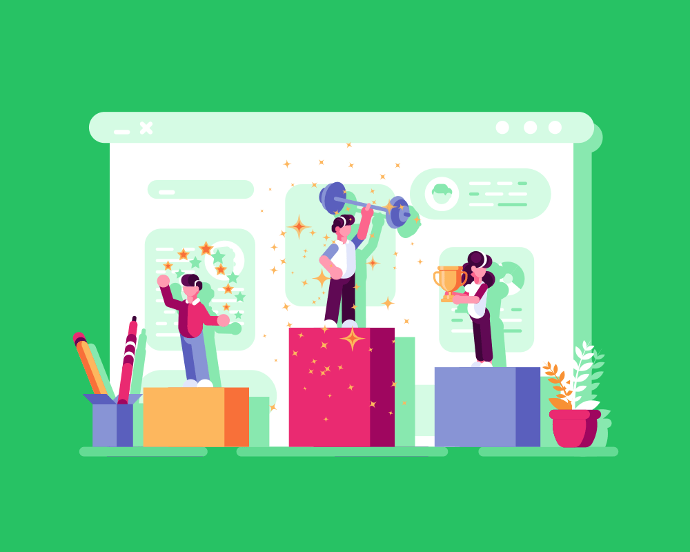
Introduction
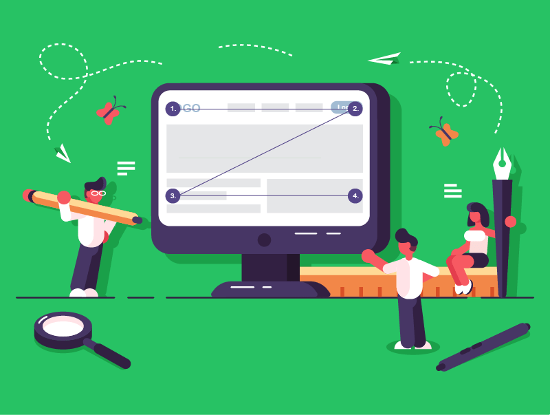
There are certain fundamental principles that govern how content is organised on a webpage (page layout) and how users move around a website (navigation).
Understanding these concepts is crucial for creating websites that are not only visually appealing but also highly functional and user-friendly.
In this lesson, we’ll learn about:
- Page layout principles
- Navigation principles
Page Layout Principles
Page layout involves arranging visual elements on a webpage to guide the user’s eye and make information easy to digest.
Effective layouts direct attention to important content, enhancing overall readability and user engagement.
Designers often employ established patterns that reflect natural human scanning behaviours, such as:
- F-shaped pattern
- Z-shaped pattern
- Grid layout
Let’s look at each of these in more detail.
F-Shaped Pattern
The F-Shaped pattern describes how users scan text-heavy pages.
They scan horizontally across the top, then down the left side, occasionally making shorter horizontal scans.
Important information, such as headlines, should be placed along the top, while calls-to-action might be positioned on the left.
This pattern is typical in news sites, blogs, and search engine results, where users are looking for specific information within large blocks of text.
Z-Shaped Pattern
The Z-Shaped pattern is typical for less text-heavy and more visually oriented pages or when guiding a user to a primary goal.
Users scan top-left to top-right, then diagonally to bottom-left, finishing bottom-right.
Branding and primary calls-to-action are ideal for top corners.
The bottom-left and bottom-right corners are ideal for secondary calls to action or important links.
This pattern is frequently used on landing pages, product pages, or simple websites to guide users toward a specific action, such as signing up for a free trial.
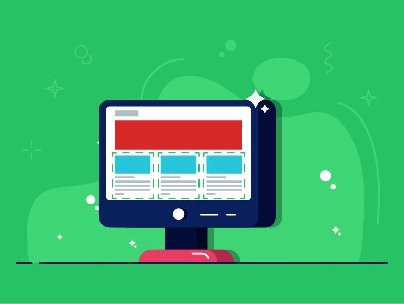
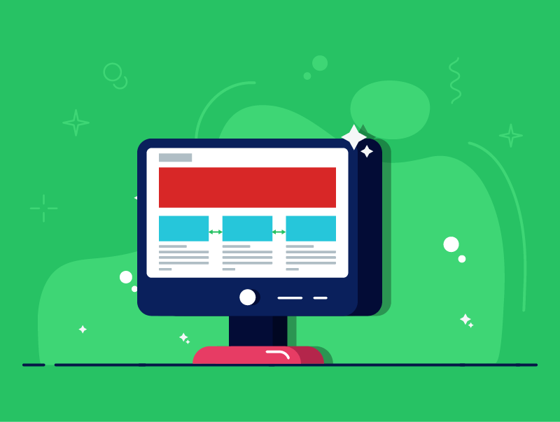
Grid Page Layout
A grid layout organises content into structured rows and columns, providing a strong visual foundation.
It ensures consistency in alignment, spacing, and proportion, creating a professional appearance.
Modern grid systems are responsive, adapting seamlessly to various screen sizes and resolutions.
Portfolio websites, online magazines, e-commerce product listings, and image galleries frequently use grid layouts to display content in an organised and visually appealing manner.
However, while grids offer structure, rigid adherence can sometimes limit creativity.
Layout Concepts
Beyond general patterns, specific concepts help designers arrange elements within any layout to enhance clarity and user experience.
These include:
- Visual hierarchy
- Grouping elements
- Separating content
- Unconventional layouts
Let’s look at each of these in more detail.
Visual Hierarchy
Visual hierarchy is the arrangement of elements on a page in order of importance.
It guides the user’s eye, telling them what to look at first, second, and so on.
A clear visual hierarchy ensures that the most critical information stands out and is easily discoverable.
Techniques include varying size, colour contrast, strategic use of whitespace, and placement.
Effective visual hierarchy reduces mental workload, helps users quickly scan content, and significantly improves overall usability.

Grouping Elements
Grouping related elements together enhances readability and understanding by leveraging Gestalt principles, such as proximity and similarity.
Placing related text, images, or interactive components close together helps users quickly grasp their connection.
Consistent styling or enclosing elements within a common boundary also aids grouping.
This reduces visual clutter and makes information feel more organised.
Separating Content
Separating distinct content sections is vital to prevent clutter and improve readability.
Techniques include using ample whitespace between sections to create visual breathing room.
Dividing lines, alternating background colours, and clear headings also demarcate different content areas.
Effective separation allows users to quickly scan and jump to relevant sections, making the page more inviting and less overwhelming.
Unconventional Layouts
Unconventional layouts deliberately deviate from traditional grids and standard patterns to create unique, memorable, and artistic experiences.
Characteristics include asymmetry, overlapping elements, and broken grids.
While offering creative expression and engaging users, they risk confusion and accessibility challenges if not executed carefully.
These layouts are ideal for creative portfolios or luxury brands, striking a balance between creativity and usability.
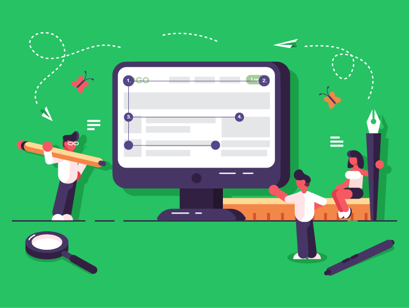
Navigation Principles
Navigation is the process by which users move around a website and locate the information they need.
Effective navigation is intuitive, consistent, and logical, ensuring a positive user experience.
There are certain standard features used in navigation to achieve this, including:
- Fixed/sticky navigation bars
- Vertical navigation
- Hamburger menu
- Logical navigation
Let’s look at each of these in more detail.
Fixed/Sticky Navigation Bars
Fixed or sticky navigation bars remain visible at the top of the screen even as the user scrolls.
This provides constant access to key links, improving user experience by allowing quick jumps between sections.
While increasing engagement and brand consistency, they can consume valuable screen space, especially on mobile, and may distract if cluttered.
Designers must strike a balance between accessibility and minimal intrusion on content.
Vertical Navigation
Vertical navigation typically positions the menu down the side of the page, often in a sidebar.
This layout is excellent for displaying a large number of links.
It utilises vertical space efficiently, leaving more horizontal space for the main content.
However, it consumes horizontal screen space, which can be limited on smaller devices, and might be overkill for simple websites.

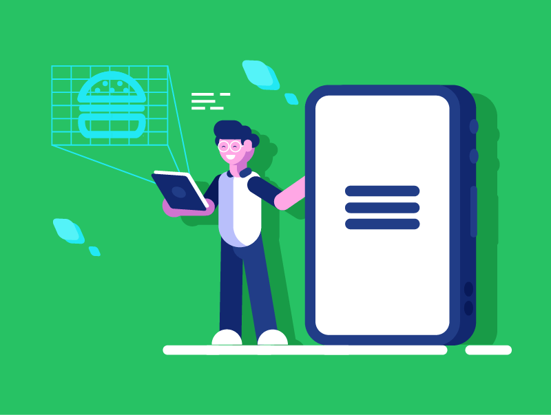
Hamburger Menu
The hamburger menu (represented by three horizontal lines) reveals a hidden navigation menu when clicked.
It’s primarily used on mobile devices to save screen space, contributing to a clean, minimalist design.
While space-saving and recognised, it requires an extra click to access navigation, which can reduce discoverability for some users.
Its desktop use should be considered carefully, often reserved for secondary navigation or minimalist designs.
Logical Navigation
Logical navigation is the overarching principle ensuring navigation links are intuitive, predictable, and easy to understand.
Key aspects include consistency across pages, unambiguous labelling, and a predictable hierarchical structure often supported by breadcrumbs.
This principle reduces mental workload, allowing users to find information without frustration.
Logical navigation is fundamental for good User Experience. A website will fail if users cannot easily navigate it.
Lesson Summary
People typically scan web pages in familiar patterns such as the F-shape for text-dense pages and the Z-shape for more visual layouts.
A grid layout arranges content in neat rows and columns, creating a consistent, responsive framework for any screen size.
Visual hierarchy, grouping, and clear separation guide the eye to what matters first, keeping pages uncluttered.
Unconventional layouts add personality and impact, but they must still respect usability and accessibility principles.
Effective navigation, whether through a sticky bar, vertical sidebar, hamburger menu, or simply well-labelled links, allows visitors to move around the site effortlessly.