Introduction
There are essential principles that govern the actual content of a website, the visual aesthetics that shape its appeal, and the crucial aspect of making websites accessible to all users.
Understanding these elements is fundamental to creating effective, engaging, and inclusive online experiences.
In this lesson, we’ll learn about:
- Content principles
- Design principles
- User experience (accessibility) principles

Content Principles
The content of a website is what users come to consume, whether it’s information, products, or entertainment.
High-quality, well-structured content is paramount to achieving a website’s purpose and engaging its audience.
We’ll look at three different types of content:
- Written content
- Visual content
- Calls-to-action
Let’s look at each of these in more detail.

Written Content
Effective written content is clear, concise, and easily scannable.
Users often scan webpages, so short sentences and paragraphs are vital.
Headings, subheadings, bullet points, and bold text improve scannability, acting as signposts for readers.
The tone of voice should align with the brand, while natural keyword integration aids Search Engine Optimisation (SEO) without sacrificing readability.

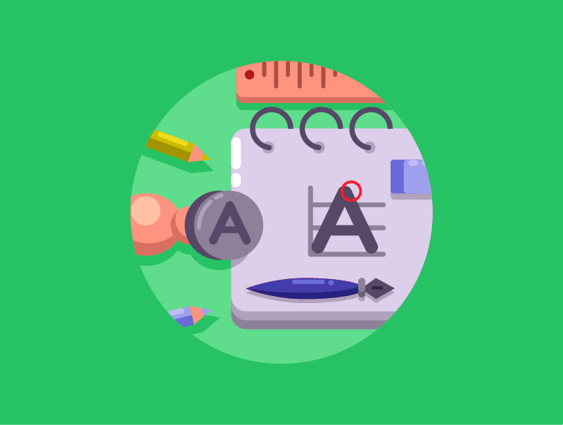
Visual Content
Visual content, such as images, videos, and icons, enhances user engagement and conveys information rapidly.
All visuals must be high-quality, relevant, and legally sourced to avoid copyright issues.
Proper file formats (e.g., JPEG, PNG, SVG & MP4) and optimisation are crucial to reduce file size, which prevents slow loading times and improves user experience.

Calls-to-Action (CTAs)
Calls-to-action are prompts that encourage users to take a specific, desired action, such as “Buy Now” or “Sign Up.“
Effective CTAs are prominently placed, use contrasting colours to stand out, and feature clear, action-oriented text.
They should focus on a single, clear action.
CTAs are vital for converting website visitors and achieving the website’s purpose.

Design Principles
Design principles relate to the aesthetic and functional choices that shape the visual appearance of a website, influencing its appeal and usability.
The two most important aspects of this are:
- Typography
- Colour scheme
Let’s look at each of these in more detail.

Typography
Typography is the art of arranging type to ensure readability and appeal, significantly impacting user experience and brand identity.
Key considerations include selecting suitable font families (e.g., serif for traditional styles, sans-serif for modern clarity), appropriate font sizes for headings and body text (e.g., a minimum of 16px for body text), and adequate line and letter spacing.
Text colour must also contrast sufficiently with the background for accessibility.
Colour Scheme
A website’s colour scheme defines its visual identity, evokes emotion, and guides user interaction.
Colours can influence mood (e.g., blue is often associated with trustworthiness) and help establish brand recognition.
Designers use colour theory, such as complementary or analogous harmonies, to select colours that work well together.
Sufficient colour contrast is essential for accessibility, and a limited palette typically enhances professionalism.

User Experience (Accessibility) Principles
Accessibility in website development refers to designing and developing websites that enable people with disabilities to perceive, understand, navigate, and interact with the web.
Important design considerations for accessibility include:
- Colour contrast
- Colour combinations
- Close captions & transcripts
- Keyboard-only navigation
- Breadcrumbs
- Customisable features
Let’s look at each of these in more detail.

Colour Contrast
Colour contrast refers to the difference in lightness between text and its background.
Sufficient contrast is vital for readability, particularly for users with low vision or colour blindness.
Web Content Accessibility Guidelines (WCAG) specify minimum contrast ratios (e.g., 4.5:1 for standard text) to ensure legibility.
Designers must test their colour choices to meet these standards.

Colour Combinations
Colour combinations can make a website easier or harder to read for different people.
Using colours that are too similar can make text and important elements hard to see.
Some users have colour blindness, such as red-green colour blindness, which makes it hard for them to tell certain colours apart.
Designers should always choose colour combinations that make content clear and easy to understand for everyone.

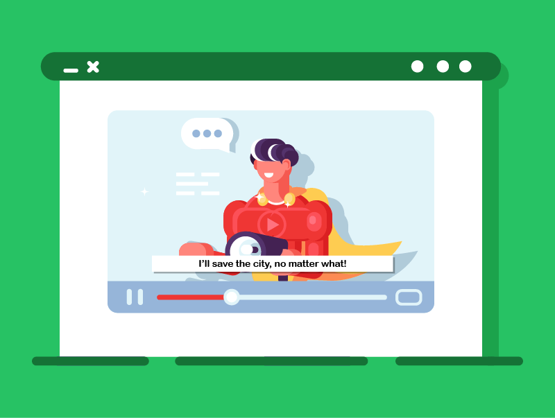
Closed Captions & Transcripts
Closed captions are on-screen text versions of a video’s audio, including dialogue and non-speech elements such as sound effects.
They are essential for deaf or hard-of-hearing users.
Captions also benefit users in noisy environments, those who prefer reading, or those watching videos with sound off.
They significantly improve video accessibility and comprehension.
A transcript is a full text version of audio or video content, typically provided separately from the media.
Unlike captions, transcripts don’t always sync with playback.
They benefit deaf or hard-of-hearing users and those with cognitive disabilities who prefer to read at their own pace.
Transcripts also enhance SEO by making content searchable.
Keyboard-Only Navigation
Many users, especially those with motor impairments, navigate websites using only a keyboard.
Websites must ensure interactive elements (e.g., links & buttons) are accessible sequentially via the Tab key, following a logical order.
Crucially, a clear visual focus indicator (e.g., an outline) must appear when an element is active, allowing users to know their current position on the page.

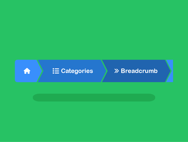
Breadcrumbs
Breadcrumbs are secondary navigation aids that show the user’s current location within a website’s hierarchical structure (e.g., Home > Category > Product).
They help users understand their position on larger websites, provide easy navigation back to parent pages, and reduce disorientation.
Breadcrumbs improve overall findability and user experience.
Customisable Features
Customisable features allow users to adjust website aspects to suit individual needs or preferences.
Examples include font size adjusters, high-contrast modes, and dark mode options.
These features empower users to tailor their viewing experience, making the website more comfortable and usable for a wider range of abilities, thus promoting inclusivity.

Lesson Summary
Website content must be clear, engaging, and well-structured to attract users and achieve the site’s goals.
Good design uses strong typography and colour choices to create an attractive, readable, and consistent experience.
Accessibility makes sure that all users, including those with disabilities, can easily use and enjoy the website.
Techniques such as strong colour contrast, colour combinations, captions, keyboard navigation, breadcrumbs, and customisable features help make websites more accessible for all users.