Introduction
Accessibility is a crucial component of delivering a seamless user experience on a website.
In the previous lesson, we examined the importance of making websites accessible to all users, including those with disabilities.
However, accessibility is just one part of a good user experience, and there are several other vital areas to consider too.
In this lesson, we’ll learn about:
- User Experience (consistency) – principles
- User Experience (user-friendliness) – principles
- User experience (use of motion & movement) principles

Consistency
Consistency in UX refers to a uniform look, feel, and behaviour across a website.
It ensures users can predict how elements function and where information is located.
This includes maintaining consistency in:
- Branding
- Page layout
- Design
- User Interface (UI) elements
Let’s look at each of these in more detail.
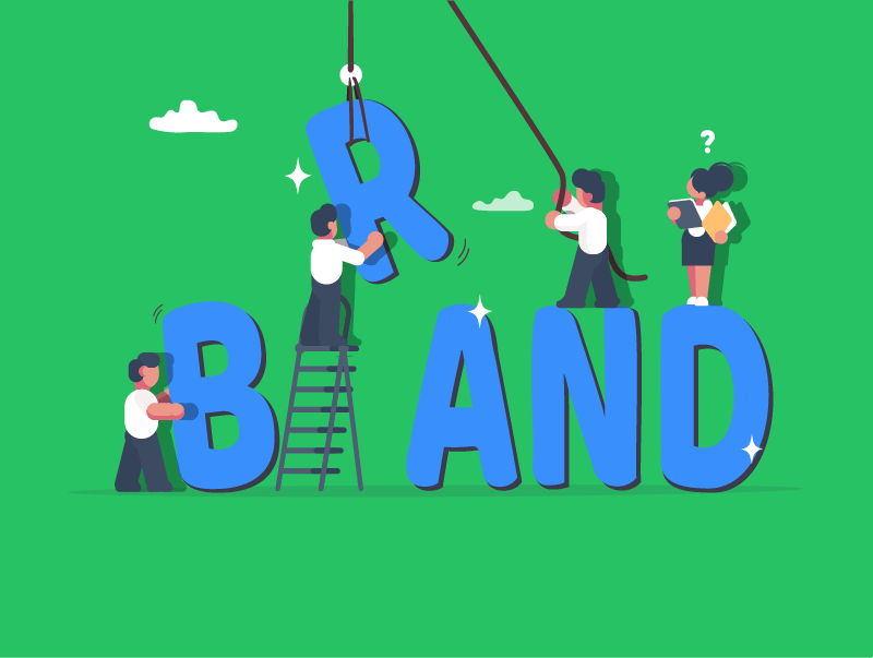
Branding
Consistent branding applies the same visual and tonal elements across all website pages and other platforms.
This includes consistent logos, colour palettes, typography, and tone of voice.
Maintaining uniformity in these elements reinforces brand identity and creates a cohesive visual experience.
It ensures users recognise and trust the brand, contributing to a unified perception.
Page Layout
A consistent page layout means that the overall structure of major content blocks remains similar across different pages.
Elements like headers, footers, and sidebars should appear in the same position on every page.
The general structure of the main content area, such as column arrangements, should also be maintained.
This helps users quickly locate information, reducing navigation effort and enhancing efficiency.
Design
Consistent design involves the uniform application of visual styles throughout the website.
This includes using a consistent style for imagery (photos & illustrations), uniform button styles, and standardised form fields.
Maintaining consistent spacing and alignment between elements ensures a clean, organised, and professional appearance.
This consistency reduces visual clutter and strengthens brand recognition.

UI Elements
User Interface elements are the interactive components that users engage with, such as navigation menus and forms.
Consistency here means these elements look and behave predictably across the entire site.
Navigation links, interactive widgets (such as sliders & accordions), and error messages should all function and appear uniformly.
This predictability builds user confidence, reduces frustration, and makes interactions feel natural.

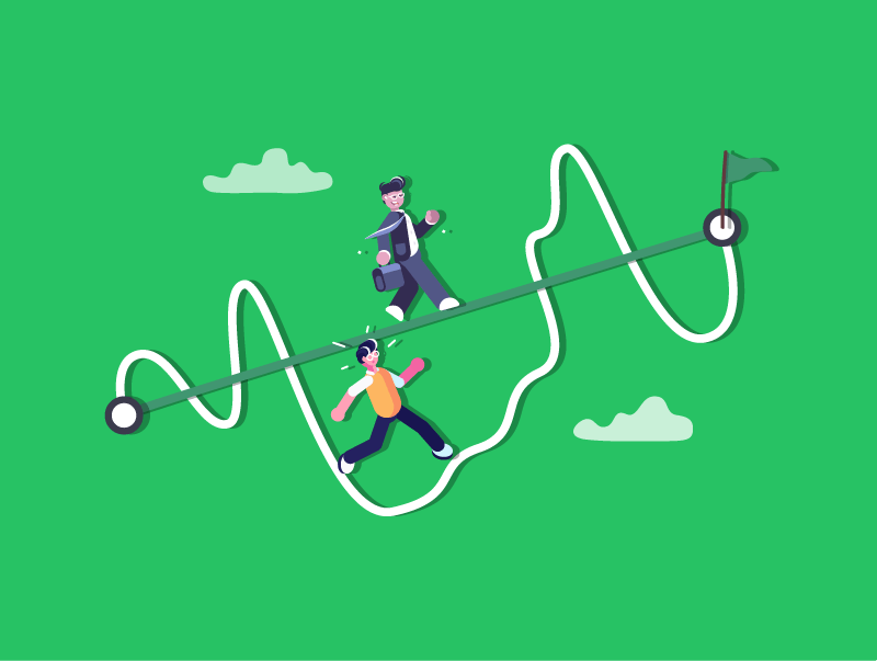
User-Friendliness
A “user-friendly” website is one that is easy, efficient, and enjoyable for visitors to use.
It anticipates user needs, minimises effort, and provides a satisfying experience.
This goes beyond just looking good; it’s about functionality and usability.
Important features of user-friendliness include:
- Simplicity
- Intuitive
- Engaging
- Responsive
Let’s look at each of these in more detail.

Simplicity
Simplicity in website design means removing unnecessary elements to create clear, direct pathways for users.
It involves avoiding clutter and focusing on essential features.
Often linked with minimalist design, simplicity utilises ample whitespace to reduce mental workload, making the site easier to navigate and process.
This approach enables users to achieve their goals more quickly, resulting in higher satisfaction and lower bounce rates.
Intuitive
An intuitive website enables users to navigate and interact effortlessly, eliminating the need for explicit instructions or prior knowledge.
It leverages familiar web patterns, such as a logo linking to the homepage or underlined text for links.
Clear “affordances” ensure buttons appear as buttons and clickable areas are easily identifiable.
This predictability reduces frustration and learning time, making the website feel natural even for first-time visitors.
Engaging
An engaging website captures and holds user attention, encouraging interaction and longer visits.
This is achieved through compelling, high-quality content and interactive elements, such as quizzes, polls, or maps.
Storytelling and personalisation can also increase relevance and memorability.
An engaging site fosters a stronger connection between the user and the brand, often leading to increased conversion rates.

Responsive
A responsive website seamlessly adapts its layout and content to fit various screen sizes, from desktops to smartphones.
This crucial modern necessity uses fluid grids, flexible images, and CSS media queries.
The “mobile-first” approach, which prioritises core content and functionality for smaller screens, ensures that these elements are consistent across all devices.
Responsiveness provides an optimal experience for all users, improving accessibility and search engine ranking.

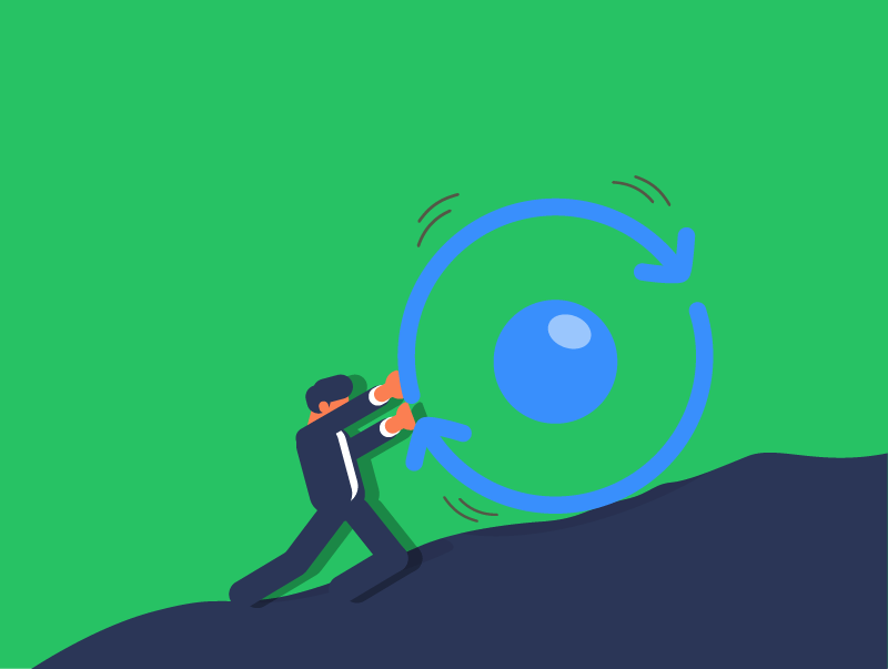
Motion & Movement
Motion and movement, when used thoughtfully, can significantly enhance a website’s User Experience.
However, excessive or poorly implemented motion can be distracting or even detrimental to usability.
Important considerations for the use of motion & movement include:
- Micro-interactions
- Animation
- Parallax scrolling
- Image sliders
- Purpose of motion
Let’s look at each of these in more detail.
Micro-interactions
Micro-interactions are small, subtle animations providing visual feedback to user actions or state changes.
Examples include a button subtly changing colour on click or a loading spinner.
Their purpose is to confirm actions, add subtle delight, guide the user, and create a sense of anticipation.
These animations are typically short, subtle, and focused on a single interaction.

Animation
Animation involves more elaborate motion sequences, often across multiple elements or to tell a story.
Examples include smooth page transitions, animated illustrations, or on-scroll content reveals.
Its purpose is to guide attention, convey status, add personality, or improve perceived performance during loading.
Animations should be purposeful and not excessive, as overuse can distract or slow performance.
Parallax Scrolling
Parallax scrolling is a web design technique where background content moves more slowly than foreground content during scrolling, creating an illusion of depth.
This effect adds visual depth, supports storytelling by unveiling elements sequentially, and enhances user engagement.
However, designers must consider potential performance issues, user disorientation, and accessibility concerns, especially for individuals prone to motion sickness.
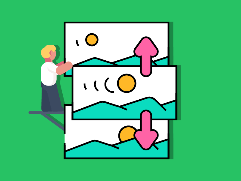
Image Sliders
Image sliders, also known as carousels, display rotating images or content, typically in a hero section.
They showcase multiple content pieces in limited space, often with auto-play and manual navigation.
While helpful in highlighting information, auto-play can be distracting, and users frequently miss subsequent slides.
Studies suggest that users tend to have low engagement with carousels for subsequent slides, as they rarely wait for them to rotate.
Static content or well-designed sections are often more effective.

Purpose of Motion
The overarching purpose of incorporating motion in web design is to enhance the User Experience.
Motion provides essential feedback for user actions, effectively guides user attention to important elements, and can convey complex information visually.
It also adds an element of delight, making interactions more enjoyable, and can improve perceived performance by making loading times feel shorter.
Lesson Summary
Consistency ensures a website has a uniform look, feel, and behaviour across all pages, helping users navigate confidently and recognise the brand easily.
User-friendliness refers to designing a website that is simple, intuitive, engaging, and responsive, allowing users to easily achieve their goals and enjoy the experience.
Thoughtful use of motion and movement can guide user attention, provide feedback, and make interactions more enjoyable, but it must be used carefully to avoid distractions.